CSS Flex
flex layout is to give the container the ability to alter its items’ width/height (and order) to best fill the available space (mostly to accommodate to all kind of display devices and screen sizes)
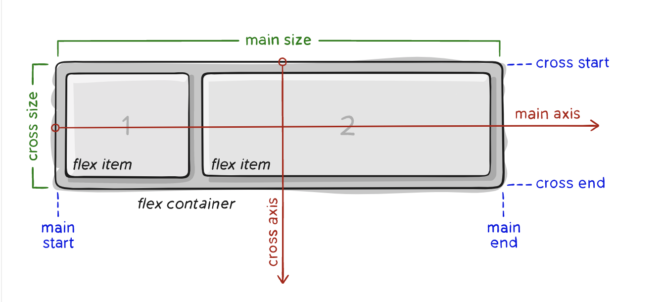
- main axis – The main axis of a flex container is the primary axis along which flex items are laid out. Beware, it is not necessarily horizontal; it depends on the flex-direction property
- cross axis(交叉轴) – The axis perpendicular(成直角的) to the main axis is called the cross axis. Its direction depends on the main axis direction.
flex container properties
/* flex/inline-flex defines a flex container */
/* inline-flex: make flex container display inline, no difference in the effect on flex items */
.container {
  display: flex | inline-flex;
}
/* define main-axis */
/* row is default */
.container {
  flex-direction: row | row-reverse | column | column-reverse;
}
/* By default, flex items will all try to fit onto one line - nowrap */
/* wrap: flex items will wrap onto multiple lines, from top to bottom */
.container {
  flex-wrap: nowrap | wrap | wrap-reverse;
}
/* shorthand for the flex-direction and flex-wrap properties */
.container {
  flex-flow: column wrap;
}
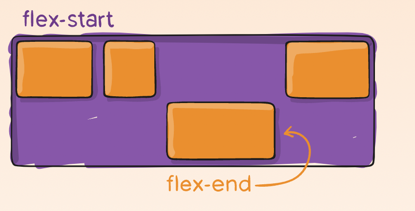
/* defines the alignment along the main axis */
.container {
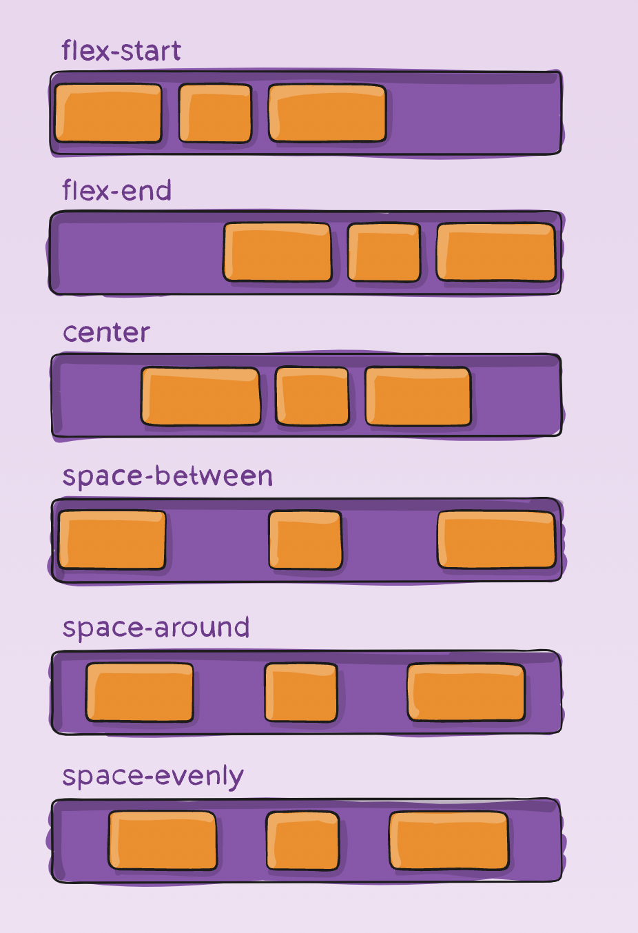
justify-content: flex-start | flex-end | center | space-between | space-around
| space-evenly | start | end + safe | unsafe;
}
flex-start vs start: flex-start takes into account the presence of the -reverse values of the flex direction, while start does not. For example, flex-direction: row-reverse, “start” would cause all items to be justified to the left, while “flex-start” would cause all items to be justified to the right.
safe and unsafe: safe ensures that however you do this type of positioning, you can’t push an element such that it renders off-screen (e.g. off the top) in such a way the content can’t be scrolled too (called “data loss”).
- space-between: items are evenly distributed in the line; first item is on the start line, last item on the end line
- space-around: items are evenly distributed in the line with equal space around them. Note that visually the spaces aren’t equal, since all the items have equal space on both sides. The first item will have one unit of space against the container edge, but two units of space between the next item because that next item has its own spacing that applies.
- space-evenly: items are distributed so that the spacing between any two items (and the space to the edges) is equal.
/* defines the alignment along the cross axis */
.container {
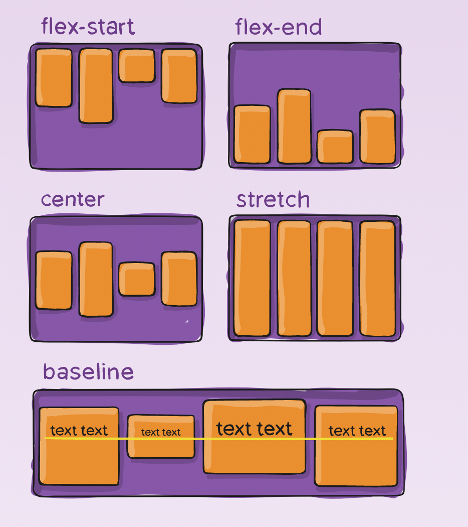
align-items: stretch | flex-start | flex-end | center | baseline | start |
end + safe | unsafe;
}
stretch (default): stretch to fill the container (still respect min-width/max-width)
/* only takes effect on multi-line flexible containers, where flex-wrap is set wrap/wrap-reverse) */
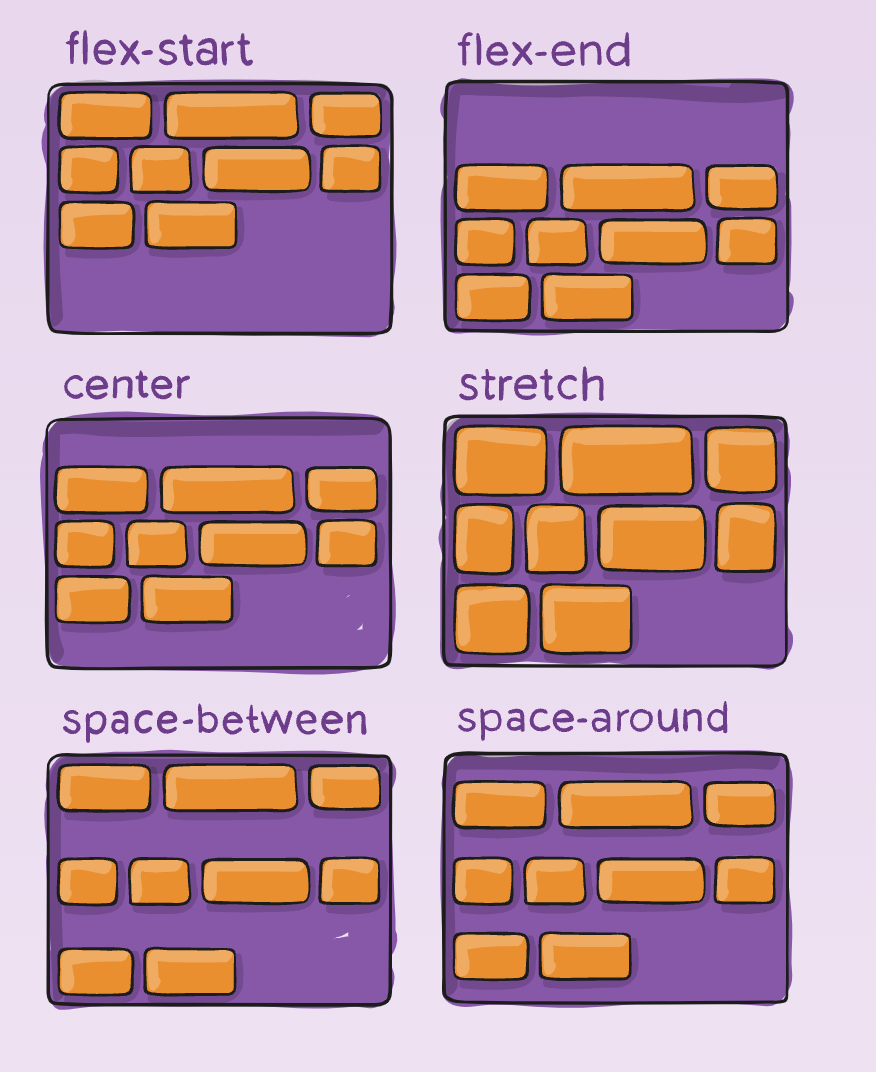
.container {
align-content: flex-start | flex-end | center | space-between | space-around |
space-evenly | stretch | start | end | baseline | first baseline | last
baseline + safe | unsafe;
}
This aligns a flex container’s lines within when there is extra space in the cross-axis, similar to how justify-content aligns individual items within the main-axis.
- normal (default): items are packed in their default position as if no value was set.
- space-around: items evenly distributed with equal space around each line
- space-evenly: items are evenly distributed with equal space around them
- stretch: lines stretch to take up the remaining space
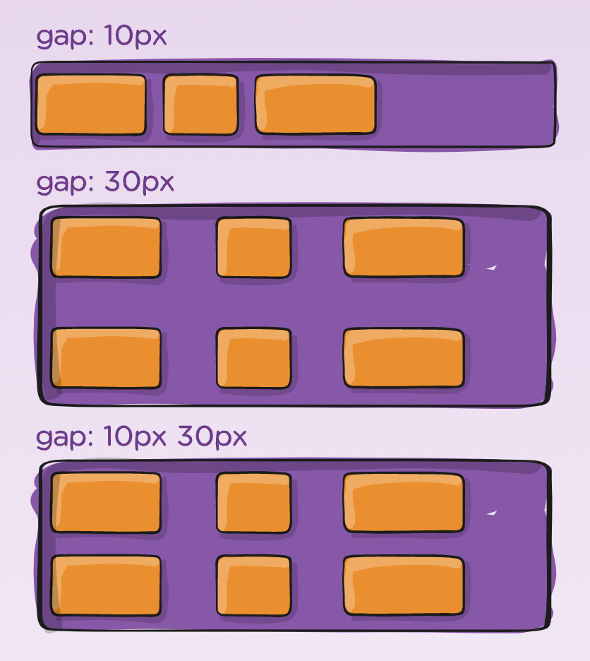
/* controls the space between flex items */
.container {
  gap: 10px;
  gap: 10px 20px; /* row and column gap */
  row-gap: 10px;
  column-gap: 20px;
}
flex items properties
By default, flex items are laid out in the source order. However, the order property controls the order in which they appear in the flex container.
.item {
  order: 5; /* default is 0 */
}
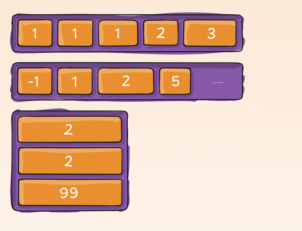
This defines the ability for a flex item to grow if necessary
.item {
  flex-grow: 4; /* default 0 */
}
This defines the ability for a flex item to shrink if necessary.
.item {
  flex-shrink: 3; /* default 1 */
}
flex-basis 元素在主轴方向上的初始大小
.item {
  flex-basis: | auto; /* default auto */
}
- number: A length unit, or percentage, specifying the initial length of the flexible item(s)
- auto: Default value. The length is equal to the length of the flexible item. If the item has no length specified, the length will be according to its content
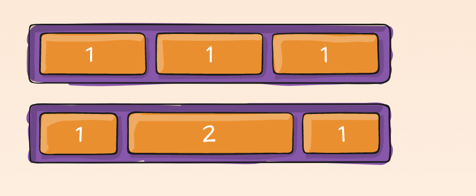
/* This is the shorthand for flex-grow, flex-shrink and flex-basis combined */
/* flex-shrink and flex-basis are optional */
/* The default is 0 1 auto */
.item {
  flex: none | [ < "flex-grow" > < "flex-shrink" >? || < "flex-basis" > ];
}
/* This allows the default alignment to be overridden for individual flex items. */
.item {
  align-self: auto | flex-start | flex-end | center | baseline | stretch;
}